

(Don't) Judge a Book by Its Cover
Project by Kristina Gorobets
Faculty mentor: Susan Clements-Vivian
This project was born out of my love for books, art, and design. I asked myself: "Why do different countries have different covers for the same book?" I have noticed speculations online regarding cover changes, differences between international editions, and design choices for covers - but never anything definitive. When this project started out, I wanted to analyze design patterns across the world and see if I could conclusively explain why cover design decisions are made in different parts of the world.
I soon realized that the extent of such research was beyond the scope of this course. Instead, I decided to focus on one case study and analyze the different covers of The Hunger Games by Suzanne Collins. My new goal with this project was to challenge readers to critically think about what a cover tells them and not dismiss this medium with the popular sentiment "Don't judge a book by its cover!"

Research
One of the reasons why I wanted to take on this project was the fact that there is little academic research on this topic. Most of the material I discovered was centered around the Western book cover design, specifically the US and UK. While there may be more research on this topic in other languages, after combing through Google (Scholar) equipped with Google translate, I still was at a loss for material.
However, there was one case study by Malin Podlevskikh Carlström that mirrored my vision for (Don't) Judge a Book by Its Cover nearly perfectly. In this case study of Generation "P" by Victor Pelevin, Carlström analyzes how the five designs fit best into their target market and how, in turn, the design decisions affect readers' perception of the content of the book. This study takes a marketing approach and details the different practices and decisions that the cover designers applied to send a very specific message.
Another important resource that provided an in-depth analysis of the different functions of book covers was The Look of the Book by David J. Alworth and Peter Mendelsund. This book provided historical context for the topic and how jacket design evolved since its birth, but especially since the 1820 when the "dust jacket" was developed as a means of protection for physical tomes.
"Book covers are treated as commercial schlock and ancillary ephemera, incidental rather than essential to literature or to any writing that appears in book form"
- The Look of the Book, Peter Mendelsund & David J. Alworth
While there were many other resources I studied to get a better understanding of the history and practice of book cover design, a particularly interesting resource I consulted was A Short History of Book Covers by Tiphainé Guillermou. As the title suggests, this four-part article goes in-depth on the history of book covers, with the fourth part specifically focusing on French publishing.
After thoroughly studying this resource, I was finally convinced that tracing the reasoning behind the differences in cover design worldwide would be, if not impossible, at the very least challenging and time consuming. Design movements that became popular in the US, Russia, Britain, Germany (etc) directly and indirectly influenced the French publishing scene through the centuries. Loud marketing and explicit visual language, popular in the US was eagerly taken up by the more progressive French publishers and simultaneously disapproved by the more conservative ones. Essentially, while all countries have gone through their own journeys in regard to cover design, they were rarely isolated and uninfluenced, and therefore, not entirely unique.
Below are additional resources that I've consulted for this project and encourage you to look into:
Cover Girl: The difficulty of illustrating Lolita persists, 60 years on. By Siobhan Lyons.
Re-covered rose: A case study in book cover design as intersemiotic translation. By Marco Songozi.
Front Cover: Great book jacket and cover design. By Alan Powers.
Balance the Books. By Design Week.
What Makes an Iconic Book Cover? By Clare Thorp.

Format, Style &
Moodboard
From the beginning, the goal of the project was creating a hand-drawn, 2D explainer-style animation. As an artist, I've always loved TedEd videos and wanted to create one inspired by that style. I saw an opportunity to encourage readers and the general public to learn more about book cover design and encourage critical thinking. It is safe to estimate that the TedEd audience are curious individuals that like casual learning and are open to watching videos about all kinds of topics, and these are the exact kind of people I would like my project to reach.
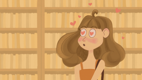
The art style I wanted to use for the animation was my natural art style simplified for easier, faster, and more expressive animation (you can see my natural illustration style in my portfolio). Below is the first style exploration I presented. After feedback and my own reflection, I realized I needed an even simpler, more loose style, which resulted in the second style iteration (below).


After a second round of feedback and further tweaking, I created the still above, which shows the style I was happy with. However, after attempting animation in this style, I realized how slowly I was making progress.
Here are some important takeaways I have regrading the animation process and style:
-
The more refined the animated character is, the higher the viewer's expectation for them to look realistic and match the tone of narration. If the character does not fit narration in the viewer's opinion, there will be unwanted dissonance.
-
Using geometric shapes as a basis for character design helps make the animation more dynamic.
-
Movement and transitions are more impactful in animation than the rendering of each individual frame. As an illustrator that does not specialize in animation, this was a particularly hard lesson to learn.
-
What is on screen does not exist in vacuum. It is very important to consider sound effects in addition to narration and music and animate to it rather than leaving it as an afterthought.
-
Show or tell - do not overexplain things. It is easy to illustrate very literally what is being said, and mostly such approach is redundant. It is important to supplement spoken information with logically connected visuals, but also to avoid the visuals being the most logical and easy illustration of the text.
-
Compositions. My initial storyboard (included below) used almost exclusively centralized compositions. There was little variation and would have made for a visually boring storyline.
-
Contrast. It is important to make visually clear what is the focal point of the scene. Since it is a drawing, there are options of adding variation to outline weight, adjusting color treatment, blurring or fading the background to make certain objects more bold.
-
Use color sparingly and to communicate a feeling and/or add emphasis to an element. For explainer-style videos, full color rendering with complex backgrounds is excessive and unnecessary. It is more effective to guide the eye of the viewer with small amounts of color.


Above you can see my original storyboard for the animation, with few details and static compositions. I realized that the format of a storyboard does not work well for me when planning a dynamic project like this, and in the future I will use a living document (a messy sketchbook perhaps) which will allow room for annotation, scribbles, notes and experimentation.
In addition, I learned that having two separate documents in different formats for a project - like a messy live document and a structured storyboard - could be useful to explore creative ideas and then format them to communicate with others.
Script Evolution
Another ceaselessly moving piece of this project had been the script. As mentioned before, I started with a more expansive, ambitious idea that has been scaled down over the course of this term. The new script would cover some historical context of book cover design, define important concepts, highlight past research on the subject, introduce the premise of The Hunger Games, go through cover-by-cover analysis of different categories I'd identified, and draw conclusions.
This structure was inspired by Malin Carlström (see section: Research), but as you can see, it was an extensive list. After receiving feedback from my mentor Susan, I realized it would be more organic to integrate terminology into the script where needed and focus on the flow and connection of ideas. I focused on creating a rigid, academic paper format for what was supposed to be a fun, informative animation. Yet again, I had to ruthlessly cut down on material.


The most important takeaway from the script writing process was learning to think in visual and audio terms simultaneously and create a narrative that connects throughout and feels cohesive and easy to follow.
On the right, you can see an excerpt of the final, formatted script that I used for the narration of the video. As I continue working on the polished version of the animation after this term, I will continue modifying the script in small ways (rephrasing ideas or changing word order where it makes sense), as I've learned that this project continuously evolves as I get a clearer vision of the final outcome.
On the left, the notes for initially proposed historical and concept section are shown. These were bot funny written out and would have amounted to many additional minutes of animation.
I went through five iterations of the script, continuously cutting it down. It was important to think visually while I was writing, and to consider which concepts could be instead translated into accompanying visuals. I cut down the script at least in half from its initial format and focused on talking quickly about the different book covers and their meanings.
I learned that I needed to trust the viewer with understanding the content and doing their own further reading if they are keen on the subject. It was unrealistic to cram everything I could into a short explainer video and organize and explain the entirety of book cover design worldwide and any patterns I could find. I also learned that most people would not want a long, extensive video on such a topic - if they do, they could look at the resources I provided in the video and the description.

Final Reflection & Rough Cut
While I have not completed a full animation as I initially set out to, I have learned a lot throughout the process and will continue working on the project beyond the course. One of the biggest takeaways I have from this project is to always have a clear goal and the big picture in mind and not hyperfocus on small details (I naturally tend to do the latter, which leads to scattered progress and inconsistencies).
Not only did I learn about the history and functions of book cover design, but I also practiced project planning, scripting, animating on Procreate, editing, and researching. I am looking forward to completing the animation and posting it online for others to learn about analyzing and appreciating book cover designs and their role in how we see stories.
If you want to see some of my other work, please feel free to visit my portfolio.